The unforgivable sin, according to Niven Boyle.
Niven Boyle’s a media planning veteran whose agency The Media Dept happens to be based in Christchurch. He’s a fan of street posters, which is why we asked about his favourite campaigns, the future of the medium, and the thing no self-respecting designer should ever do on posters.
How did you come to be in the ad business, and why did you set up The Media Dept?
I fell into it really. After a background in airline sales and marketing and then being involved in setting up Sports Betting in New Zealand, I moved back to Christchurch and got a suiting job with a local agency. It didn’t take long for my boss to realise I was better suited to media because I was good with numbers and loved going out for long lunches. Those were the days…
I suppose it was just a natural progression to start my own company, which was over 10 years ago now.
What is it like being based in Christchurch?
We’ve got a lot less fences and buildings than we used to have. There are fewer site options, and without much of a CBD there still isn’t the pedestrian traffic that other cities have. Owners of new buildings seem less keen on having posters, which makes things a bit trickier.
Whilst we run a lot of national campaigns, we do tend to become quite adept at making budgets stretch further as we’re used to working with budgets that have a lot less ‘0’s!
As far as planning and buying New Zealand-wide campaigns, we can do anything that agencies in other centres can.
What’s the place of street posters in the media landscape?
Posters are great for delivering frequency and getting into areas not available to other media. As soon as you’ve hit the streets you’re immediately communicating to a lot of people. You can saturate a city or target a particular suburb, so the flexibility is ideal.
Name a street poster campaign that sticks in your mind.
I still remember the old AMI Insurance campaign ‘Party at Kelly Browne’s’. While it ran across a number of other media, I first recall seeing street posters in odd places and wondering what the hell was going on. It could have been the embryo of social media – you decide you’re having a party and put posters up everywhere to make sure 10,000 gatecrashers turn up.
What’s your biggest bugbear with the way people use the medium?
Creative that uses size 7 font!
Seriously, I don’t understand why so much outdoor advertising looks like a transposed magazine ad. A simple, clear message and as few words as possible should be deemed mandatory. If that is ignored then the creator should be sent to Outdoor Design 101 for remedial lessons.
Could you share a story of a poster campaign that worked brilliantly?
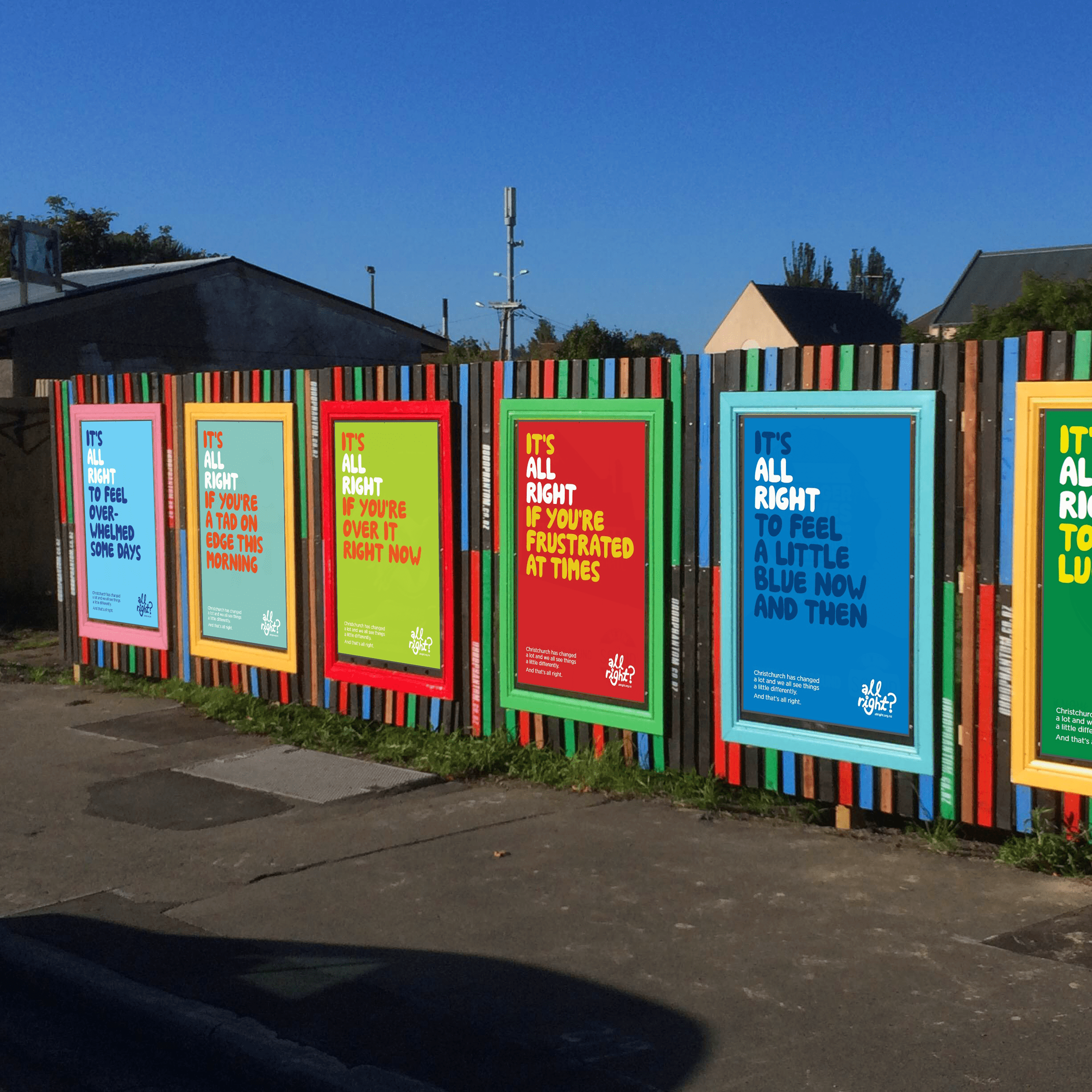
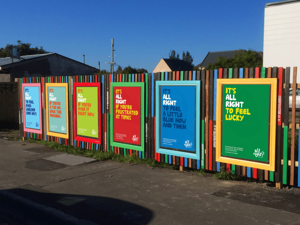
I’ll always remember the very first campaign we did for ‘All Right?’ This is a Healthy Christchurch initiative set up through Canterbury District Health Board after the earthquakes. The timing and creative were perfect after what had happened to the city. It captured many of the emotions of the time and just totally resonated with people.
Any thoughts on the future of street posters, especially in today’s media landscape?
I think there will always be a place for real posters. Digital will become more prevalent as time goes on but there are still things only the printed word can do. For example, your printed street poster is up 24/7 for as long as you’ve booked the site, instead of being displayed on rotation for a fraction of that time.
For the foreseeable future I can’t see posters being usurped.
See what Niven Boyle is talking about- book your campaign today


