
On the street, attention is earned in seconds. Street posters exist in the real world, on busy streets and building walls, and they have seconds to make an impression before someone walks past.
Designing for the street is a different discipline from designing for digital or print. People aren't looking for your message. They're moving, distracted, and surrounded by everything else competing for their attention. A great street poster fits the street and still stops you in your tracks.
Phantom Billstickers has been putting campaigns on New Zealand streets since 1982. Here's what we've learned about what works.
Pictured: Celebrity Treasure Island's Custom Shop Installation on Pitt Street, Auckland.

The best street posters do one thing well. Trying to pack in multiple messages or offers might feel thorough, but on the street, it just creates noise.
Before the design starts, get clear on what you need the poster to do. Is it building brand awareness? Promoting an event? Driving people to a specific location? Every decision that follows should serve that single purpose. A focused brief leads to a focused design, and a focused design is what people actually notice.
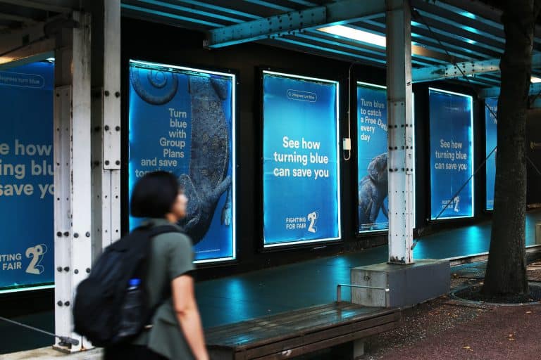
Here's an example from 2degrees and TBWA of an effective campaign using Super Posters and LED's at our Queen Street site in Auckland.
Street environments are visually noisy. Your poster is going up alongside shop signs, other posters, traffic, and everything else competing for attention on a busy street. Most people won't be looking for it. That means visibility has to be built into every design decision from the start, not added as an afterthought.
Use light text on dark backgrounds or dark text on light backgrounds. Low contrast designs tend to blend into their surroundings and go unnoticed. On the street, contrast isn’t just a style choice; it’s essential for visibility.
Choose bold, distinct colours that reflect your brand while standing out against the surrounding environment.
Keep the background simple and uncluttered. A busy background competes with your message, making it harder to read. A clean backdrop helps your key elements stand out clearly.
Your headline is the most important element on the poster. It's often the only thing people read as they move past, so it needs to make an impact in an instant.
Here's another example of Super Posters, by metal band Helmet.

One of the biggest mistakes in street poster design is trying to say too much. People aren't stopping to read. They're moving through their day, and your poster has a second or two to make an impression before they're gone.
That means being ruthless about what goes on and what stays off. Stick to what matters most. What is it? When and where? And what's the next step, a location, a short link, or a QR code? Everything else is a distraction. The cleaner the poster, the stronger the message.
What looks great on screen doesn't always hold up on the street. Real-world conditions affect how your poster is seen and experienced.
Most people will see your poster from several metres away, not standing right in front of it. Design with that viewing distance in mind.
People may be walking, cycling, or driving past. Your design needs to remain clear and effective even when seen in motion.
Your poster should be easy to read in both bright sunlight and in the softer light of early morning or evening.
How your design translates across different sizes matters. An A3 on a Wellington arts bollard is read up close by someone who's stopped and paying attention. A Super street poster at nearly five square metres needs to land instantly from a distance.
Where your poster goes is as much a part of the design as what's on it. A high-traffic Auckland street calls for something bold and immediate, designed to land in the second it takes someone to walk past. A Wellington arts bollard is read up close by someone who's already stopped, which means it can carry a little more. Same campaign, different creative decisions.
Phantom's account managers have decades of experience placing campaigns across New Zealand's cities and towns. They'll help you work out not just where your poster goes, but how your design should adapt to make the most of every location and format for your campaign.
Attention without a next step is a missed opportunity. It doesn't need to be complicated. A short link, a social handle, or a QR code is enough. QR codes work particularly well on street posters because they remove every barrier between curiosity and action. One scan and someone is on your website, your event page, or your social channels without having to remember a URL or search for your brand name.
Keep it visible and keep it simple. And make sure wherever it leads is worth the visit.
Great street poster design comes down to clarity, confidence, and understanding the environment your poster will live in. One clear message, one strong visual, and smart placement. Get those things right, and your campaign doesn't just show up on the street. It becomes part of the street itself.
Get in touch with the Phantom team. Let's build something street-level, high-impact, and impossible to ignore.