Late last year, we launched a one of a kind competition.
Nope, not the data harvesting, Instagram sharing kind that we’ll all unfortunately been accustomed to.
Something a little more celebratory, something bigger.
Little old Aotearoa, land of the long white cloud, at the edge of the world, boasts way more than good food, good wine and good people. Whilst the epicentre of creativity can often be linked to London and New York, New Zealand undoubtedly holds in own.
As a nation, one thing we don’t always do well is to celebrate our wins, a la Tall Poppy Syndrome.
We wanted to change that, with 100s upon 100s of epic brands and businesses based out of, and producing in New Zealand, we wanted to give them the opportunity to showcase their brands on our network. Labs style.
The rules?
Be an NZ owned business and pitch us your dream campaign idea that would feature in large scale, as part of our epic Labs builds.
We were inundated by entries, from all industries.
Small to big, the ideas we saw took us days to work through. Multiple full scale team meetings ensued, fuelled by coffee and passion and a few heated discussions.
In the end, we came up with 3 winners. Hand picked by the team.
The judging criteria came down to this; which entrant took what Phantom Billstickers does, and implemented their idea seamlessly onto our network.
Christchurch Winner: Garage Project.

Garage Project provided us with a detailed pitch, focussing on our network in Christchurch.
They showed a clear understanding of how best to utilise what Phantom does best.
With the focus on the growing market for their brand in Christchurch, they took full advantage of proximity mapping (we put you where your target audience is).
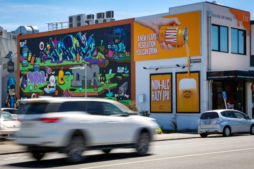
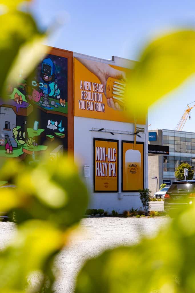
Audiences, and marketing aside. They came in HOT with the creative. Utilising all aspects of the Manchester Street site to work together in unison to convey a clear message.
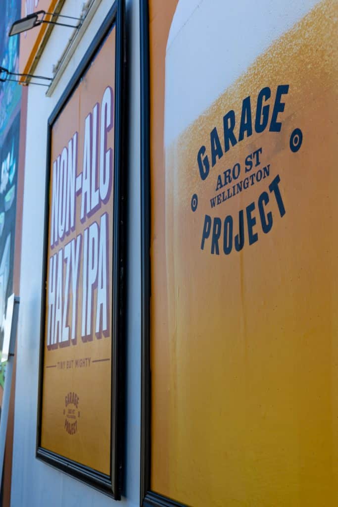
Using the landscape billboard up top to feature what can only be described as one of your mates pouring out a cold one, they blended the bottom frames, utilising clear, on brand typography and an image which has us grabbing the nearest beverage to quench our thirst.
As a final touch of magic, and really bringing it all together, GP utilised our recyclable pop-out material to showcase the beauty of the pour from the can, adding both impact and depth to the overall campaign.
Job well done GP, this ones a beast.
Heading to the nearest GP dispensary to grab a 0% thirst quencher.

